
Case study
Elastic Path Multi-location Inventory
Elastic Path Multi-Location Inventory empowers merchandisers to seamlessly manage inventory across multiple locations. This service enables them to create and organise various locations, adjust inventory levels as needed, and gain a clear overview of inventory availability
Role:
Senior UX Designer
Employer:
Elastic Path
Platform:
Web app
Project length:
4 months


01/Context
Backstory
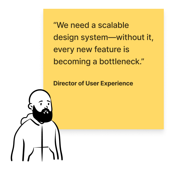
Elastic Path, a B2B eCommerce SaaS company, faced growing demand for multi-location inventory management—a feature their existing system didn’t currently support. Around this time, a new Director of User Experience began leading a company-wide product rebrand and a roll-out of a new design system. My mission: design and launch the entire service while building and refining components critical to this project and future-proofing the design system for future services.
Expanding upon an existing design system
In 2023, Elastic Path acquired Unstack, along with its design system. The pre-existing Elastic Path design system was thin and unmanaged, while Unstack’s was larger but incomplete—offering atoms and some molecules, but no organisms, templates, or pages.
Multi-location inventory became the first service to implement the Unstack system. Tasked by the Director of UX, I took charge of expanding its use, defining scalable UI patterns and UX principles to shape a cohesive, future-proof platform.
Why it mattered
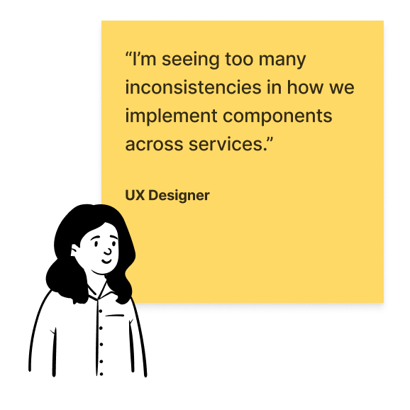
Without a cohesive design system, Elastic Path’s product suffered from inconsistencies—hastily built components by UX designers and front-end developers created a fragmented user experience. The rush to deliver features left the product difficult to scale, and the lack of alignment within the UX team on components and conventions threatened the long-term viability of the platform.
This project was an opportunity to future-proof the design system, laying the foundation for scalable, consistent, and high-quality design across all services. It also addressed a critical gap: while the company had rebranded the previous year, the SaaS product’s front end had been an afterthought. Solidifying the product’s visual identity aligned it with the brand and elevated its credibility, creating a design foundation capable of supporting Elastic Path’s ambitious growth.
This project wasn’t just about launching a service—it was about building the framework that would make future services faster, more scalable, and more aligned with Elastic Path’s brand.
An early stage prototype exploring navigation.
02/Dual mandate
Organisation-wide design challenges
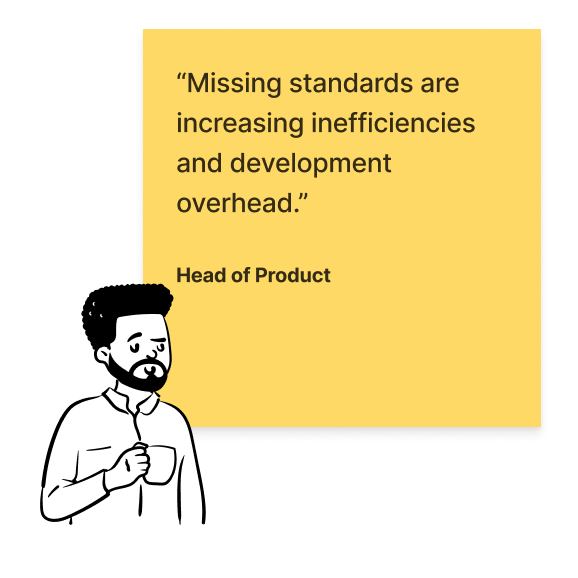
Across the organisation, the absence of a solid design system caused inefficiencies, bottlenecks, and inconsistencies. Scaling features became harder, and delivering a seamless, on-brand experience was impossible. A unified, scalable design foundation was urgently needed.

Merchandisers can view location details, location properties and the location change log.
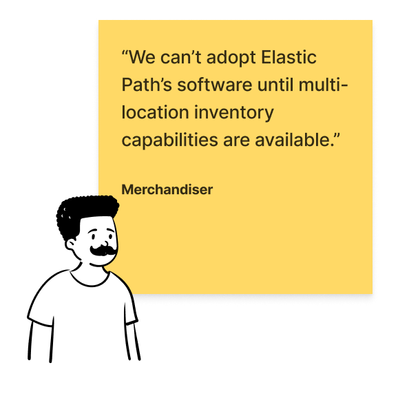
The urgent need for multi-location inventory management
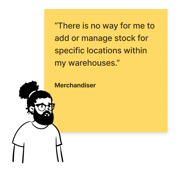
Merchandisers identified significant gaps in Elastic Path’s capabilities, including the inability to manage stock at specific locations or track inventory levels accurately. The absence of multi-location functionality forced reliance on third-party tools and prevented adoption of Elastic Path’s software.


03/Process
Guided design by principles
I defined the following principles which shaped my design decisions, focusing on efficiency, consistency, and visual appeal to address user needs while future-proofing the platform.
1
Streamlining user efficiency
I focused on reducing time to task by prioritising the things that users would do the most e.g. checking and managing inventory levels, not editing location details.
2
Scalable design and reducing design debt
I ensured that whilst creating designing the service the components could be used across the platform with the same UX/UI patterns.
3
Elevating product aesthetics
A modern, polished UI expanding on existing components allowed the UX and Product team to enhance user trust and make the product more aligned with the overall brand identity.
Tab navigation exploration.
Side navigation exploration.
Moving the needle
Taking Charge Amid Mixed Feedback
The UX team faced indecision and conflicting feedback, stalling progress. I stepped up, made the final design decisions, and secured approval from the Director of UX. This broke the deadlock, driving the project forward while keeping the team aligned.
Engaging Senior Stakeholders
The senior leadership team, including the Head of Product and Chief of Product, reviewed the designs alongside the Director of UX to ensure alignment on the aesthetics, branding, and vision for the new UI components.
Iterative design: from concept to completion
sitemapping • mid-fi design • design system components • team reviews
The multi-location inventory service was developed through a structured, iterative process. A sitemap laid the foundation, mapping out a clear structure and flow. Low-fidelity wireframes explored functionality and captured early feedback. Mid-fidelity designs refined layouts and interactions, while high-fidelity iterations polished the final product. Each step prioritised user needs, stakeholder input, and scalability, ensuring an effective solution.
Sitemapping
Low-fi designs
Mid-fi designs
Iterations
04/Evolving designs
A prototype for removing products from a location.
The evolution of the location details screen
feedback loops • reviews • refinement
One example of the iterative design process was the location details screen was a journey of six iterations, shaped by collaboration, feedback, and decisive action.
From concept to complete
Daily touchpoints with the Director of UX ensured quick feedback loops, keeping the project moving forward efficiently. At the end of each week, the Director of UX and I consulted with the UX team to address any objections to the proposed UI patterns, rulesets, and components.
The location details screen started as a lo-fi design, initially adopting a side navigation structure similar to the rest of the platform. However, based on the principles I had devised, the Director of UX and I determined this approach was unsuitable. The side navigation:
Wasted valuable screen real estate.
Created unnecessary visual noise, given users would rarely edit location details and primarily focus on managing inventory.
Was redundant in many contexts.
As the design evolved, location details were moved behind a cog icon in the top-right corner, with merchandisers landing directly on the inventory view when selecting a location. This change prioritised efficiency and ensured the screen better aligned with user needs.
Version 1
Version 2
Version 3
Version 4
Version 5
Version 6: final screen
05/Componentizing
Building a scalable UI foundation with components
I worked closely with the Director of Product for Studio (formerly Unstack) to ensure the UI was properly componentised for the design system. Rulesets were carefully documented with the UX team, securing alignment and buy-in from other designers for scaling components across future services.
I ensured existing design system atoms and molecules—such as colours, drop shadows, buttons, and iconography—were implemented correctly, enabling a smooth handover to the design system manager. This ensured consistency and scalability across the platform.
Various components such as tables, modals and dropdowns.
Various sheet components used across the service.
06/Business impact
1
New service launched, enabling merchandisers to manage inventory across multiple locations seamlessly.
25+
New, reusable UI components designed, setting the standard for adoption across other services and simplifying future rebranding efforts.
07/Showcase
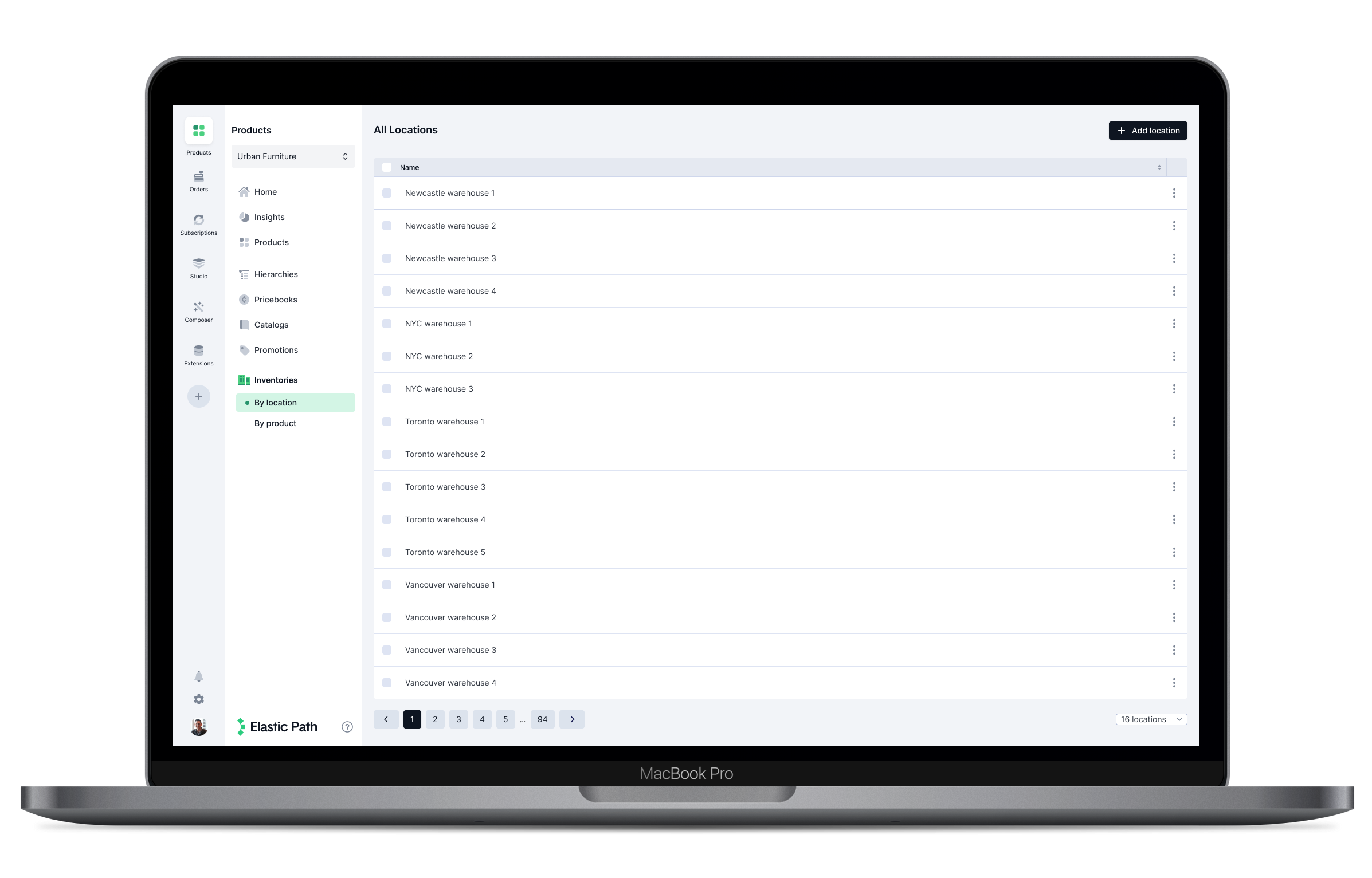
Merchandisers can view all locations and add new locations.
Merchandisers can create a location or click on a location to view the details, edit details and manage the inventory.
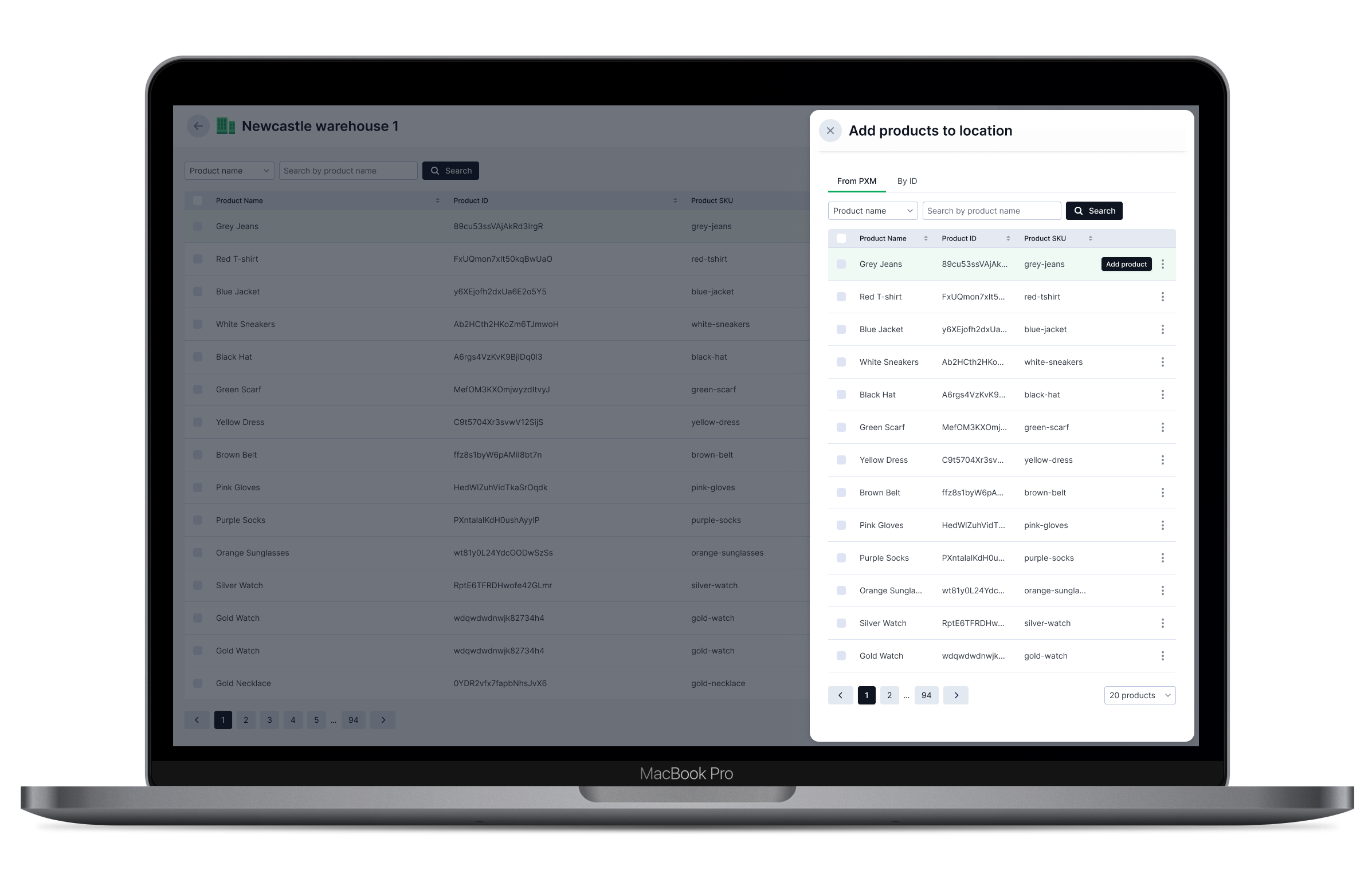
Merchandisers can add products to a location.
Merchandisers can add products to a location by searching by name, ID or SKU.
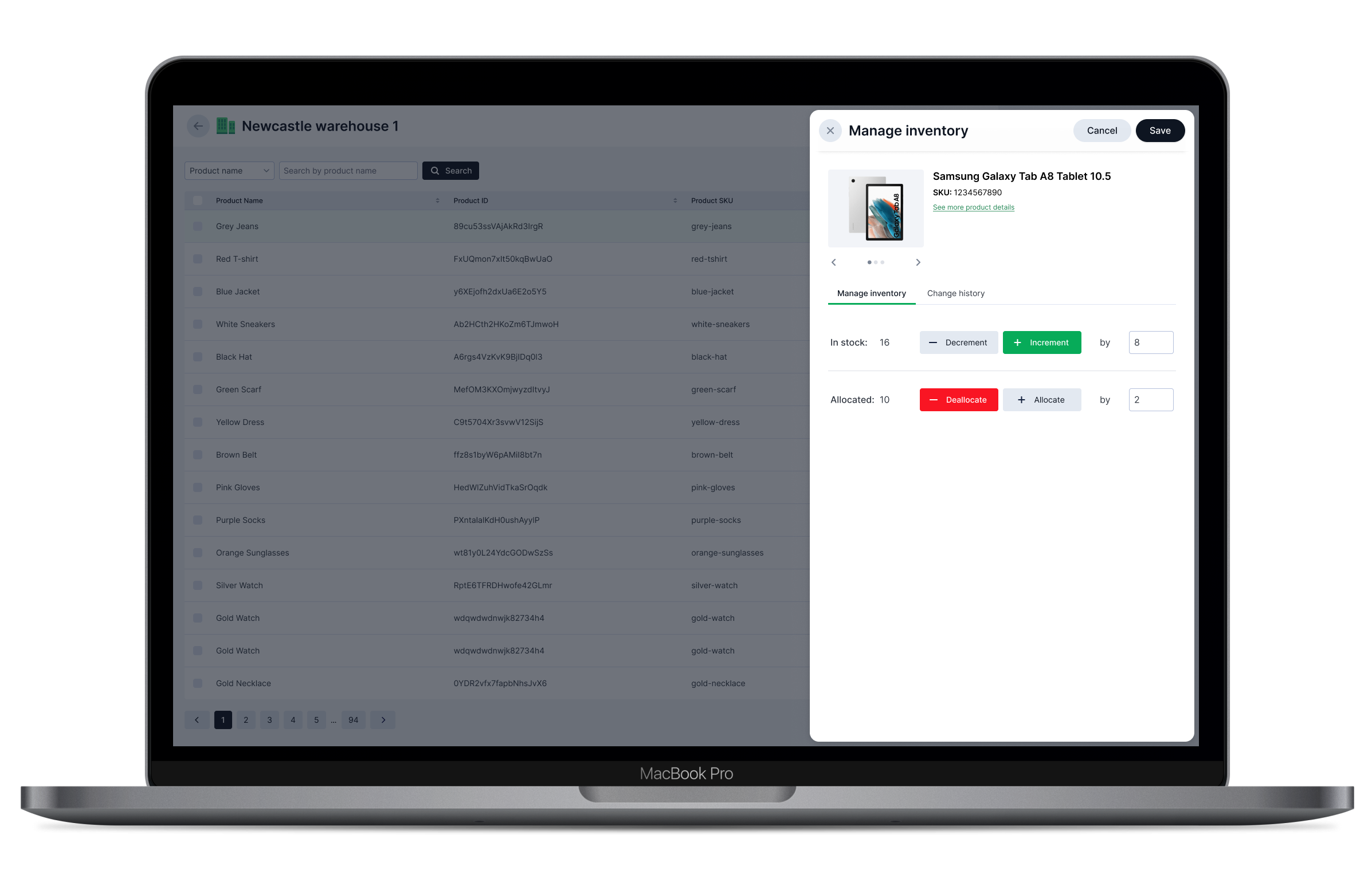
Merchandisers can manage the inventory levels of products within a location.
Merchandisers can increment, decrement, allocate or deallocate for any given product within any given location.
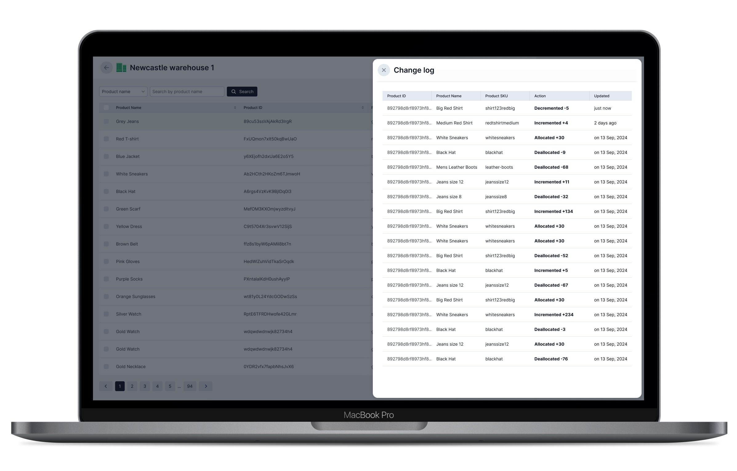
Merchandisers can view the change log for each location
Merchandisers can view the change log for any given location to see the changes being made to inventory levels in real time.
Merchandisers can view all products across all locations.
Merchandisers can view all products across all locations and click on a product to see which locations it belongs to.